Office Design

The History of the Open Office

Select Your Level

B1
Intermediate
★★
B2
Upper-Intermediate
★★★
C1
Advanced
Powered by MIM Language Services

Office Design: The History of the Open Office

Level: B2 (click to change)

Office Design

The History of the Open Office

Open vs Closed · Design History · Workplace Vocabulary

Open vs Closed: The Debate

Companies need to use their office space well. They want a space that looks good for customers. They also need to give employees a comfortable place to work.

Which is better — a closed office or an open office? Companies like open offices because they use space efficiently and cost less. They are also easy to change. Studies show that workers can be more efficient as a team in an open space because they communicate better.

But most employees prefer closed offices. They like having their own space. They think they work better because there is less noise. Some jobs need quiet concentration, like writing or programming.

Companies need to use their office space efficiently. They want a space that projects a good image for visiting customers, while also providing comfortable and healthy conditions for employees — two goals that don't always align.

Which is better — a closed or an open-plan design? Companies favour open offices because they use space efficiently, cost less, and are flexible to reconfigure. Research also suggests teams communicate better without walls — questions get asked more easily, and junior staff can observe and learn from colleagues nearby.

On the other hand, most employees actually prefer closed offices. They value having their own space and believe they work better with less noise. Some roles demand deep concentration as well as collaboration — for creative tasks like writing, design, or programming, a quiet workspace matters enormously.

The open-versus-closed office debate sits at the intersection of two competing organisational priorities: the efficient use of costly real estate and the provision of conditions under which employees can actually perform well. Companies frequently frame this choice around image and cost, while the underlying evidence on productivity is considerably more contested.

Proponents of open-plan layouts point to efficient space use, lower square-footage costs, and greater configurational flexibility, along with claims of improved cross-team communication and incidental knowledge transfer. Critically, however, employee preference data consistently favours enclosed workspace: most workers report that closed offices reduce noise-related distraction and better support tasks requiring sustained cognitive focus.

The resolution, in most well-designed workplaces, is a deliberate balance between open and enclosed zones — a balance calibrated to the actual nature of the work being performed, rather than applied as a uniform, cost-driven policy across an entire organisation.

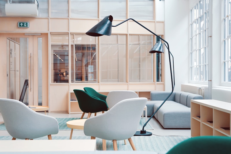
Modern open-plan office

Before Modern Offices

Open offices are not a new idea. Big open workplaces existed a long time before smartphones and startups. Clerical workers did their jobs in big, open rooms as early as the 1750s.

Look at old photos of a post office from 1872 — many people worked together in one large open room, with rows of desks close together. It looks a lot like a modern open office!

But for most of history, small private rooms were more common. By the 1900s, more and more people were spending their working day inside an office.

Open offices are not a modern invention created by tech startups. Clerical work was carried out in large, open spaces as early as the 1750s, and photographs of a US post office from 1872 show clerks working at rows of desks in one continuous open room — remarkably similar to today's open-plan spaces.

Despite these early examples, small private rooms remained the more typical layout for most of the 18th and 19th centuries. It was only by the early 1900s, as clerical and administrative work expanded rapidly, that ever larger numbers of people began spending their entire working day inside an office building.

This expansion set the stage for architects to begin asking a new question: how should all this office space actually be designed?

The popular narrative that open-plan offices are a recent, tech-industry innovation misrepresents the historical record. Large open clerical workspaces are documented as early as the 1750s, and photographic evidence of an 1872 US post office shows clerks working at densely packed rows of desks within a single undivided room — a layout structurally indistinguishable from contemporary open-plan design.

Nonetheless, compartmentalised, small-room layouts remained the dominant convention for most of the pre-industrial and early industrial period. The decisive shift occurred in the early twentieth century, as the scale of administrative and clerical labour expanded dramatically alongside the growth of large corporations, prompting architects to confront office design as a distinct professional problem for the first time.

This context matters: it establishes that the open office is best understood not as a single, continuous tradition, but as an idea that has been repeatedly rediscovered, refined, and — as this lesson will show — repeatedly degraded through imitation.

Vintage office with rows of desks

Frank Lloyd Wright's Masterpiece

The famous architect Frank Lloyd Wright wanted offices to feel more open. In 1939, he designed a new headquarters for the SC Johnson company in Wisconsin, USA.

The building was a beautiful open office. Wright believed new materials like steel let him build in bold new ways. He even said that a building made of small, closed boxes felt unfree — he wanted architecture that felt open and democratic instead.

Wright designed everything himself — the tall, tree-shaped columns, the desks, and the chairs. There was lots of space between each desk. Wright said his design worked so well that employees started having tea together in the afternoon, and they didn't want to go home!

Frank Lloyd Wright, one of America's most celebrated architects, believed offices could be transformed from "a series of boxes and closets" into spaces with a genuine sense of openness. After experimenting with open-plan offices in Buffalo in 1909, he created his masterpiece thirty years later.

In 1939, the SC Johnson company commissioned Wright to design its new administrative headquarters in Racine, Wisconsin. The result was a stunning open office, made possible by innovative dendriform — tree-shaped — columns so slender they worried building inspectors. Natural light poured in through the ceiling, and visitors compared the effect to a cathedral.

Wright personally designed every desk and chair, leaving generous space between workstations, while managers received private offices on a mezzanine level above the open floor. Wright later claimed the design was so successful that staff began taking afternoon tea together and were reluctant to go home.

Frank Lloyd Wright's 1939 administrative building for SC Johnson represents a pivotal counter-example within the history of open-plan design — proof that the concept, when executed with genuine architectural rigour, could produce results fundamentally different from what "open office" would later come to signify. Wright's ideological framing was explicit: he characterised the enclosed box as "a fascist symbol," arguing that "the architecture of freedom and democracy needed something beside the box."

The building's success rested on specific design decisions rarely replicated in later imitations: slender dendriform columns that dissolved the visual weight of the ceiling; a naturally lit interior that visitors likened to a cathedral; and custom-designed furniture calibrated to the specific proportions of the space, including generous inter-desk spacing that management-tier private offices on a mezzanine complemented rather than contradicted.

Notably, Wright's design was not without flaws — his custom three-legged chairs proved structurally unstable and were later replaced — a reminder that even landmark design achievements involve genuine trial and error, not flawless execution.

Grand open architectural interior with columns

Bürolandschaft & Action Office

Copies of Wright's open office removed all his careful design. Offices became open, but without the beauty or the extra space. People began looking for a new solution.

In the 1950s, a movement started in Germany called Bürolandschaft, which means "office landscape." It made offices open, but arranged furniture in a flowing, flexible way instead of straight rows.

In America, a furniture company called Herman Miller created something similar called "Action Office." Its designer, Robert Propst, wanted furniture that broke up the open space and could be rearranged easily for different types of work.

As companies copied Wright's open office without his careful attention to detail, the results were often crowded, poorly lit spaces that captured none of the original's quality. This gap between the ideal and the imitation created demand for a new approach.

Starting in Germany in the 1950s, a movement called Bürolandschaft — literally "office landscape" — reached America by the 1960s. Rather than arranging desks in rigid, boxy rows, it organised offices in a fluid, organic layout, keeping the space open while allowing much greater flexibility.

Herman Miller pursued a parallel idea with its "Action Office" system, designed by Robert Propst. Rather than fixed desks, it used specially designed, modular furniture that broke up open space into distinct zones, allowing for easy interaction as well as easy rearrangement as teams and tasks changed.

The generation of open offices that followed Wright's SC Johnson building illustrates a recurring pattern in design history: influential architectural ideas, once mass-adopted, are frequently stripped of the very details that made them successful, producing what might be called "a copy of a copy of a copy." Wright's careful spacing, custom furniture, and natural lighting were routinely discarded, leaving only the absence of walls.

Bürolandschaft, emerging in 1950s Germany and reaching the US by the 1960s, represented a deliberate corrective: it retained openness while explicitly prioritising flexibility, replacing the boxy, rigid layouts of firms like DuPont Chemical with fluid, organically arranged floor plans responsive to actual workflow patterns.

Herman Miller's Action Office, designed by Robert Propst, pursued a structurally similar goal through different means — modular, purpose-built furniture organised around specific task groups, engineered for constant reconfiguration. Both movements shared a core premise largely absent from later imitators: that openness without deliberate, ongoing design attention produces poor outcomes, and that genuine flexibility requires sustained investment, not a one-time floor plan decision.

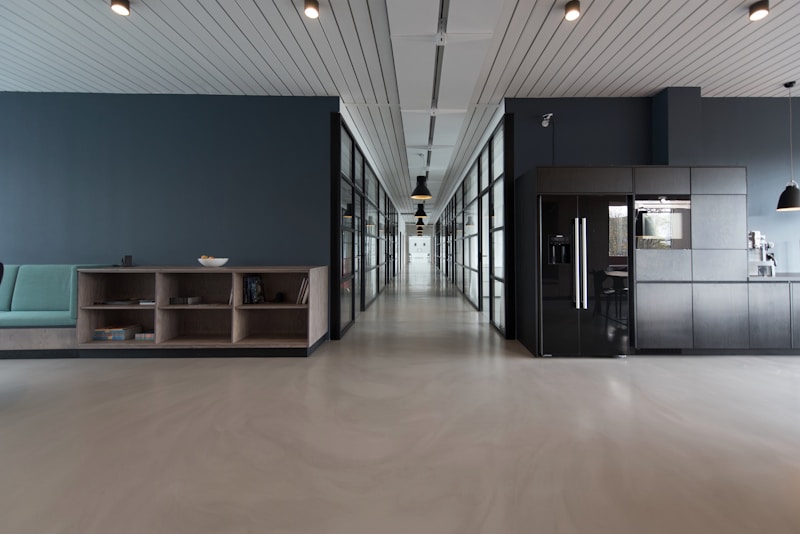
Flexible modular office furniture

Copy of a Copy: The Cubicle Farm

Just like Wright's design, Bürolandschaft and Action Office were also copied badly. Companies kept the walls and dividers, but forgot the flexibility and careful planning behind them.

Over time, thoughtful designs slowly became something much worse: the cubicle. Rows of small, grey boxes filled offices everywhere. People felt trapped and unhappy.

Today's "cool" open offices are often a reaction against hated cubicles. But many of them also lack the careful design of Wright's building, or the smart flexibility of Bürolandschaft. In some ways, we ended up with the worst parts of both ideas.

History repeated itself. As companies copied Bürolandschaft and Action Office, they preserved the visible feature — partitions dividing the space — while discarding the underlying purpose: flexibility, thoughtful furniture design, and attention to how people actually work.

The result, over subsequent decades, was the modern cubicle farm — endless grids of small, semi-enclosed workstations that offered neither the privacy of a closed office nor the collaborative energy of a truly open one.

Contemporary open-plan offices are, in part, a reaction against cubicle culture. But many modern open offices repeat the same historical mistake: they adopt the appearance of openness — removing walls to reduce real estate costs — without the design investment that made Wright's or Herman Miller's spaces genuinely effective.

The trajectory from Bürolandschaft and Action Office to the modern cubicle farm exemplifies the same degradation pattern that had earlier converted Wright's masterful open office into crowded, undesigned open-plan imitations. Companies retained the superficial marker — physical partitions — while abandoning the underlying design philosophy of adaptable, purpose-built furniture responsive to task requirements.

The resulting cubicle environment delivered neither meaningful privacy nor genuine collaborative benefit, producing widespread employee dissatisfaction and cementing "cubicle" as a byword for demoralising corporate space.

Contemporary open-plan offices largely emerged as an explicit rejection of cubicle culture, yet frequently reproduce the identical structural flaw: they are justified publicly through appeals to "collaboration" and "openness," while their primary driver — as with earlier waves — remains the reduction of costly per-employee square footage. The persistent gap between stated rationale and underlying economic motive is precisely what critics identify as the central credibility problem of the contemporary open-office movement.

Rows of grey office cubicles

Case Study: High Crest Electronics

High Crest Electronics has an office in a city centre. It is old, and there is not enough space. The managers want to redesign it, so they are considering two different proposals from an architect.

The company boss wants a big private office to impress visiting customers, and an open-plan area so they can see what everyone is doing. A programmer wants a closed office for quiet concentration, but also a social area for coffee breaks.

An accountant doesn't mind open or closed space, but wants more room — the workstations feel too small. A receptionist prefers open plan because it has natural light and feels less isolated, with more social contact during the day.

High Crest Electronics occupies an old, cramped city-centre office and is now weighing two competing redesign proposals from an architect — one that management must reconcile with very different staff priorities.

The company boss wants a large private office to impress visiting clients, paired with an open-plan floor for the rest of the team so management can maintain visibility over daily operations. A programmer, by contrast, wants an enclosed office for uninterrupted concentration, while still valuing an informal social area for coffee and conversation.

An accountant is relatively indifferent to open versus closed layouts but is frustrated by cramped workstations and wants considerably more room. The receptionist strongly favours the open-plan option, citing access to natural light and a preference for the social contact and reduced isolation that open layouts provide.

The High Crest Electronics case illustrates how office redesign decisions rarely admit a single objectively correct answer, since different roles impose genuinely divergent spatial requirements that a single floor plan must somehow reconcile.

Management's preference for a private office combined with open-plan visibility over staff reflects a common — and contested — assumption that oversight correlates with productivity. The programmer's preference for enclosed, uninterrupted workspace aligns with established evidence that tasks demanding sustained cognitive focus are measurably degraded by ambient noise and visual interruption.

The accountant's and receptionist's positions further demonstrate that role-specific factors — spatial adequacy, access to natural light, degree of desired social contact — often matter as much as the open/closed binary itself. Resolving such a case, as any experienced office designer will recognise, requires negotiated compromise rather than a uniform policy applied indiscriminately across every role in the organisation.

Architect reviewing office floor plans

Comparing & Contrasting Workspaces

When we compare two things, we can use these words and phrases:

  • Comparatives: "An open office is cheaper than a closed office." / "Closed offices are quieter."
  • Compared to / Compared with: "Compared to a closed office, an open office is easier to change."
  • But / However: "Open offices save money. However, they can be noisy."
  • Both... and...: "Both open and closed offices have advantages."
  • On the other hand: "Open offices help teamwork. On the other hand, closed offices help concentration."

Practice: Use these phrases to compare open and closed offices, or to compare Frank Lloyd Wright's office design with a modern cubicle farm.

Comparing and contrasting workspace types requires a specific set of connectors and structures. Here are the most useful for discussing office design:

  • Unlike / Whereas: "Whereas open offices prioritise flexibility, closed offices prioritise privacy."
  • In contrast to: "In contrast to Wright's carefully designed open office, most modern imitations lack attention to detail."
  • Similarly / Likewise: "Bürolandschaft aimed for flexibility. Likewise, Action Office used modular furniture to allow rearrangement."
  • While: "While open-plan layouts reduce real estate costs, they can also reduce concentration on demanding tasks."
  • The main/key difference is: "The key difference between Bürolandschaft and a cubicle farm is flexibility."

Note: Choose contrastive connectors (whereas, unlike) when highlighting a genuine trade-off, and additive connectors (similarly, likewise) when two things share an underlying goal despite different execution.

Precision in comparative discourse becomes especially important when evaluating design movements that share stated goals but differ substantially in execution — as with the successive waves of open-office design covered in this lesson. Consider the following register distinctions:

  • Surface comparison: "Cubicles have walls; open offices don't." — purely descriptive, no evaluation.
  • Evaluative contrast: "Whereas Wright's design paired openness with meticulous spatial planning, most contemporary open offices pursue openness at the expense of such planning." — signals a critical judgment.
  • Conceding similarity while asserting difference: "Although both Bürolandschaft and the modern open office claim to prioritise collaboration, only the former substantiated that claim with genuinely flexible, purpose-built furniture."
  • Structural parallel: "Just as Bürolandschaft was diluted into the cubicle farm, today's open office risks being remembered as a diluted echo of Wright's original vision."

Discussion: Using this register, construct an argument for or against the claim that most contemporary open offices are, fundamentally, cost-saving measures dressed in the language of collaboration.

Two contrasting office spaces

Key Takeaways

  • Open vs closed: Open offices are cheaper and help teamwork, but many employees prefer closed offices for quiet, focused work.
  • Not a new idea: Open offices existed as early as the 1750s — a post office from 1872 already looked like a modern open-plan space.
  • Frank Lloyd Wright: In 1939, Wright designed a beautiful, carefully planned open office for SC Johnson, with tree-shaped columns and custom furniture.
  • Bürolandschaft & Action Office: These 1950s–60s movements kept offices open but focused on flexibility — until they too were badly copied.
  • Language focus: Use comparatives and phrases like "compared to," "on the other hand," and "unlike" to compare open and closed office designs.
  • The core trade-off: Open offices save money and can improve team communication; closed offices better support concentration and are what most employees actually prefer.
  • A long history: Open-plan clerical work dates to the 1750s. Wright's 1939 SC Johnson building proved that open offices, designed with real care, could be genuinely excellent.
  • The "copy of a copy" pattern: Wright's design, then Bürolandschaft, then Action Office — each was thoughtfully designed, and each was degraded through careless imitation into cramped, poorly planned spaces, eventually producing the cubicle farm.
  • Comparing workspaces: Use connectors like whereas, in contrast to, similarly, while to compare office design movements precisely and highlight genuine trade-offs.
  • The case study: Different roles (boss, programmer, accountant, receptionist) often want different things from an office — good design requires balancing these needs, not applying one layout to everyone.
  • Contested efficiency claims: The open-office rationale of "collaboration and openness" frequently masks a primary cost-driven motivation — a tension this lesson's featured video makes explicit.
  • Design integrity vs. cost-driven imitation: Wright's SC Johnson building, Bürolandschaft, and Action Office each paired openness with deliberate, sustained design investment; each was subsequently diluted by imitators who retained only the absence of walls.
  • The cubicle as case study in degradation: The cubicle farm exemplifies how a genuinely flexible design philosophy (Action Office) can be reduced to its most superficial, least effective feature through cost-driven mass replication.
  • Comparative register: Discourse connectors — whereas, at the expense of, just as... today's... — encode evaluative stance as well as comparison, and are central to advanced analytical writing about design history.
  • Applied judgment: The High Crest Electronics case demonstrates that resolving open/closed design questions requires negotiated, role-specific compromise rather than a single organisation-wide policy.
Elegant open office interior

Lesson Complete!

Continue Your Learning

Vocabulary Flashcards

Open Office
Click to see definition
A workplace design without walls or private rooms, where many employees share one large space
Closed Office
Click to see definition
A private room with walls and a door, used by one person or a small team
Layout
Click to see definition
The way a space is arranged or organised
Concentrate
Click to see definition
To think very carefully about one thing and not be distracted
Efficient
Click to see definition
Working well and using time, money, or space without waste
Employee
Click to see definition
A person who is paid to work for a company or organisation
Architect
Click to see definition
A person who designs buildings
Collaborate
Click to see definition
To work together with other people to achieve something
Open-Plan
Click to see definition
An office layout with few or no internal walls, so employees share one continuous space
Partition
Click to see definition
A wall or panel that divides one part of a room from another
Cubicle
Click to see definition
A small work area separated from others by low, moveable walls or partitions
Workspace
Click to see definition
The physical area where a person does their job
Distraction
Click to see definition
Something that takes a person's attention away from what they are doing
Renovate
Click to see definition
To repair and improve a building so that it is in good condition again
Real Estate
Click to see definition
Property, especially land and buildings, considered in terms of its value or cost
Flexible
Click to see definition
Able to change or be rearranged easily to suit different needs
Dendriform
Click to see definition
Shaped like a tree, with a design that branches outward
Office Landscape
Click to see definition
A large open office area arranged in a natural, flowing way rather than in straight, boxy rows (from the German "Bürolandschaft")
Egalitarian
Click to see definition
Based on the belief that all people should be treated equally, with equal status and opportunity
Aesthetic
Click to see definition
Relating to beauty or the visual appearance of something
Hierarchy
Click to see definition
A system in which people or spaces are organised by rank or level of importance
Degradation
Click to see definition
The gradual worsening or loss of quality of something over time
Modular
Click to see definition
Made of separate parts or units that can be combined or rearranged in different ways
Imitation
Click to see definition
A copy of something original, often lacking the quality or detail of the thing it copies

Interactive Quiz

Question 1 of 8

Writing Practice

Writing Task

High Crest Electronics is redesigning its city-centre office and has asked staff for feedback before choosing between the two proposals. Imagine you are one of the employees from the case study (the boss, the programmer, the accountant, or the receptionist). Write an email of approximately 200–250 words to the office manager. Your email should: (1) explain which proposal you prefer and why; (2) compare open-plan and closed-office layouts using comparative language (e.g. "compared to," "whereas," "on the other hand"); and (3) refer to at least one idea from the video's history of office design (for example, Frank Lloyd Wright's SC Johnson building, Bürolandschaft, or the cubicle farm) to support your opinion. Use vocabulary from the lesson in your response.